Icon row block - Heading 1
The icons section block can hold icon row blocks.
Different types of normal content blocks.
A specific block that allows you to add + icons on top of a Epi-picture (not available in Qbank) which opens up small blocks in a pop-up with picture, text and link.
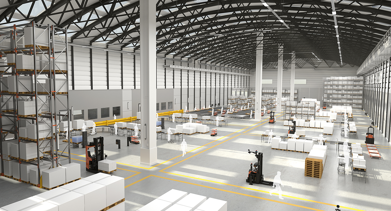
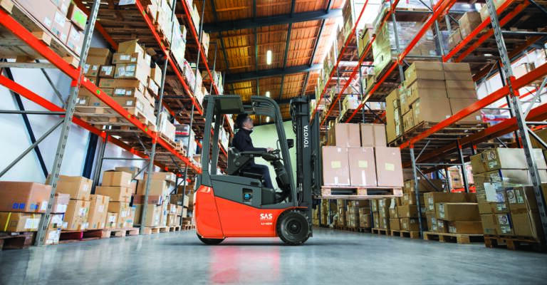
In this example;
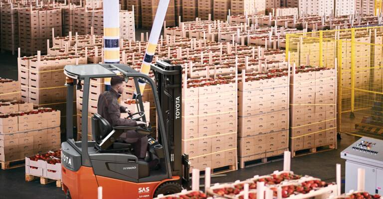
Here is a large block with only a subheading in H3, and the image on the left side.
No CTA buttons, but a text link directly in the text editor.
Padding is enabled, so see the difference between white space above and below this block.
The optimal number of characters to get the text as the same height as the image is 1000 characters when using the H3 subheading.
Without a subheading, it's about 1300 characters.
And the definition of characters, copied from Wikipedia is: letters, numerical digits, common punctuation marks (such as "." or "-"), and whitespace.
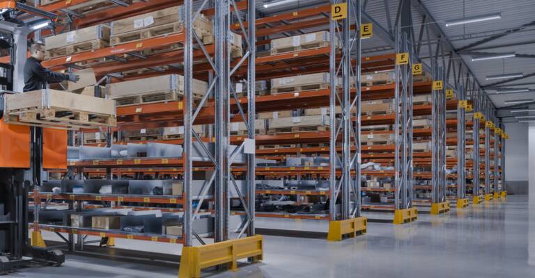
In this example, we are using 33 % splitter layout to shrink the block height.
Just plain text and a small image.
The optimal amount of characters with subheading is 600, and without subheading it is around 1000 characters.
In this example:
Could be used as an introduction if you have three Small blocks, but want to create a whole row of four small blocks.
In this example:
In this example:
The optimal number of characters is hard to say. The most important thing is to have equal number of the small blocks next to eachother, so they align.
So these four are not a great example for that purpose. This is just for showing the different options.
This a wrapper block that 1) clean up your content area by keeping all small blocks in one place 2) gives you the chance to choose if a set of small blocks should have a boarder or not on this page without sabotaging the layout of other pages.

In this example:
Could be used as an introduction if you have three Small blocks, but want to create a whole row of four small blocks.

In this example:
In this example:
The optimal number of characters is hard to say. The most important thing is to have equal number of the small blocks next to eachother, so they align.
So these four are not a great example for that purpose. This is just for showing the different options.
The divider block allows you to create centered content. A heading with the options between H1-H3, and also there is a main body text area where you can write an introduction text.
It can also be used to create a centered heading for other block types.
FAQ blocks can be added in the FAQ section block.
It has a text property shown as the question, and a text area for the answer.
The answer area is a text editor, so you are able to add and format text, bullet lists, links and images from Q-bank.
In this example:
On the right side of the FAQ blocks, you are able to add text or Q-bank images inside the text editor. This block still has the old image handling, the property called "Right column image" and "Image", don't use those. It will soon be developed to insert images från Q-bank.
Heading (H1-H3)
This can also be used in main area and not only promotion area. The proportions is a bit different and you'll see more of the video. Heading and text is optional.
This is a mosaic block, which is a block where you can add different block types inside, but mainly it should be used together with mosaic column blocks. In this block we have three mosaic column blocks inside. You can use either 4 blocks that are 1 column wide, or 2 blocks that are 2 columns wide to create a row. You can have more rows as well.
Mosaik column block 2 - without link
Product blocks can be used to show products from all our categories. Just drag in products from the catalog. The block can be used on start page, content pages or in the jumplinks for product category pages. Preferrably to be used together with a divider block, to get a centered heading above. A link can be added as well, shown as a button or plain text.
You could use this block to highlight two different benefits in text,
and with different background colors to make them pop.
You could use this block to highlight two different benefits in text,
and with different background colors to make them pop.
You could use this block to highlight two different benefits in text,
and with different background colors to make them pop.
You could use this block to highlight two different benefits in text,
and with different background colors to make them pop.
You could use this block to highlight two different benefits in text,
and with different background colors to make them pop.
You could use this block to highlight two different benefits in text,
and with different background colors to make them pop.
You could use this block to highlight two different benefits in text,
and with different background colors to make them pop.
You could use this block to highlight two different benefits in text,
and with different background colors to make them pop.
You could use this block to highlight two different benefits in text,
and with different background colors to make them pop.
You could use this block to highlight two different benefits in text,
and with different background colors to make them pop.
You could use this block to highlight two different benefits in text,
and with different background colors to make them pop.
You could use this block to highlight two different benefits in text,
and with different background colors to make them pop.
Máte záujem o naše školenie alebo máte nejakú otázku? Vyplňte náš formulár alebo nás kontaktujte:
E-mail: miroslav.tazar@sk.toyota-industries.eu
Tel: +421 2 48252552
hubspot_50_50
You can embed your HubSpot forms with this block. You can choose to have it on the left or the right side, by inserting the embed code for the HubSpot form in the HubSpot code snippet property.
And you will also be able to add an image or text on the other side of the form.
In the Main Body property in Epi/Optimizely, you can write a short introduction or an explanation to what the visitors can expect from the map.
Can be used to show a pin on a map.
We use it mainly for showing our factories and sales offices around the world.
But if you are creative, you can probably find other uses for it as well.
You can create links in the text editor, or use the link property.
Overlay Text is a text area where you can write even more information. This is shown when no map pin is selected, because there you can write other information, and insert links. There are four different colors of pins, and you can name them in the bottom of the map block settings.
Test
Toyota Material Handling Austria GmbH
Griesfeldstrasse. 3, A-2351 Wiener Neudorf
Download:
Toyota Material Handling Belgium NV/SA
Schoondonkweg 1, 2830 Willebroek
Toyota Material Handling CZ s.r.o.
K Vypichu 1049, 252 19 Rudná u Prahy
Toyota Material Handling Danmark
Industrivej 3, 3550 Slangerup
Toyota Material Handling Baltic Branch Estonia
Scala City, Tartu mnt. 43, 10128 Tallinn
Download:
Toyota Material Handling Finland Oy
P.O. Box 12, Korpivaarantie 1, FI-01450 Vantaa
Toyota Material Handling France
Parc Gustave Eiffel, 4, avenue de l'Europe,
77607 Marne La Vallée Cedex 3
Toyota Material Handling Greece SA
2nd str. Olympic Shooting Center, 190 03 Markopoulo, Attica, Greece
Download:
Toyota Anyagmozgatás Magyarország Kft.
Építész u. 28, H-1116 Budapest
Download:
Toyota Material Handling Italia S.r.l.
Via del Lavoro, 93/1, 40033 Casalecchio di Reno, Bologna
Download:
ISO 9001 - UKAS | ISO 9001 - ACCREDIA | ISO 14001 | ISO 45001 | ISO 50001 | ISO 30415 | UNI PdR 125
Toyota Material Handling Baltic
Duntes 11, LV 1013 Riga, Latvia
Download:
Toyota Material Handling Baltic Vilnius Branch
Naugarduko str. 3, Vilnius
Download:
Toyota Material Handling Nederland B.V. Postadres: Postbus 371, 6710 BJ Ede Bezoekadres: Stevinlaan 4, 6716 WB Ede
Download:
BMWT-Keur Duurzame bedrijfsvoering
BMWT-keur Kwaliteitssysteem
VCA 291
EcoVadis
Toyota Material Handling Norway AS
Vuluvegen 331
7563 Malvik
Download:
ISO 14001
TMHNO FOR2011 12 06 nr.1360 Opplæring
TMHNO FOR2011 12 06 nr.1360 Sakkyndig kontroll
EcoVadis
ISO 50001
Toyota Material Handling Polska Sp z o.o.
Jakuba Potockiego 1a
96-313 Jaktorów, Poland
Download:
Toyota Material Handling Romania s.r.l.
Sos. Berceni nr. 104V sector 4, cod 041912, Bucuresti
Download:
ISO 9001
ISO 14001
ISO 37001
ISO 45001
ISO 50001
EcoVadis
Toyota Material Handling Slovensko s.r.o.
Vajnorská 134/B, 831 04 Bratislava
Download:
CERTIFIKÁT ENVIRONMENTÁLNE ZODPOVEDNÉHO VÝROBCU
CERTIFIKÁT – preukázanie plnenia povinností výrobcu v OZV NATUR – PACK, a.s.
Toyota Material Handling Spain
Avda. Arrahona, 25 Conjunto C, Pol. Ind. Can Salvatella, 08210 Barberá del Vallés
Toyota Material Handling Sweden
Solna Gate, Hemvärnsgatan 9, 171 54 Solna
Download:
ISO 9001 & 14001 - English
ISO 50001 - English
EcoVadis
Toyota Material Handling UK
706 Stirling Road, Trading Estate, Slough Berkshire, SL1 4 SY
Toyota Material Handling Manufacturing Sweden
Svarvargatan 8, 595 35 Mjölby, Sweden
Certificates download:
ISO 9001, 14001 and 45001
ISO 27001
ISO 50001
Ecovadis
Policies download:
Quality policy
Environmental policy
Occupational health and safety policy
Toyota Material Handling Manufacturing France
Z.A.C. de l'Aeropole, 44150 Ancenis
Download:
Lift Truck Equipment S.p.A
Via Caravaggio, 6, 44020 Ostellato, Ferrara
Download:
ISO 9001
ISO 14001
ISO 45001
ISO 50001
ISO/TS 14067
EcoVadis
Toyota Material Handling Manufacturing Italy
Via Persicetana Vecchia, 10, 40132 Bologna
Download:
ISO 9001
ISO 9001 ITA
ISO 14001
ISO 14001 ITA
ISO 45001
ISO 45001 ITA
ISO 50001
ISO 50001 ITA
EcoVadis
Ako dôkaz nášho lokálneho záväzku k udržateľnosti si môžete stiahnuť naše ocenenia od EcoVadis a certifikáty systémov riadenia podľa ISO prostredníctvom našej mapy Európy.
Nasledujúce certifikáty a ocenenia získala aspoň jedna z našich výrobných závodov a/alebo marketingových a predajných spoločností: ISO 9001; ISO 14001; ISO 14067; ISO 45001; ISO 50001; ISO 27001; EcoVadis
Modré značky označujú výrobné závody, červené značky naše miestne MSCO pobočky a čierne značky naše logistické centrá.
Using this block you can add smaller scripts to your page. For example, here is a map script from the German market.

Description

Description
Toyota Material Handling Austria GmbH
Griesfeldstrasse. 3, A-2351 Wiener Neudorf
Toyota Material Handling Belgium NV/SA
Schoondonkweg 1, 2830 Willebroek
Toyota Material Handling CZ s.r.o.
K Vypichu 1049, 252 19 Rudná u Prahy
Toyota Material Handling Danmark A/S
Industrivej 3, 3550 Slangerup
Toyota Material Handling Baltic Eesti filiaal
Sära tee 11 / 5, Peetri, Rae vald, 75312
Toyota Material Handling Finland Oy
P.O. Box 12, Korpivaarantie 1, FI-01450 Vantaa
Toyota Material Handling France SAS
Parc Gustave Eiffel, 4, avenue de l'Europe
77607 Marne La Vallée Cedex 3
Toyota Material Handling Deutschland GmbH
Hannoversche Straße 113, 30916 Isernhagen
Toyota Material Handling Greece SA
2nd str. Olympic Shooting Center, 190 03 Markopoulo, Attica, Greece
Toyota Anyagmozgatás Magyarország Kft.
Építész u. 28, H-1116 Budapest
Toyota Material Handling Italia S.r.l.
Via del Lavoro, 93/1, 40033 Casalecchio di Reno, Bologna
Toyota Material Handling Baltic SIA
Dzelzavas iela 127, Rīga, LV-1021
Toyota Material Handling Baltic Lietuvos filialas
Galinės g. 1, Galinės k, Avižienių sen., LT-14247, Vilniaus raj
Toyota Material Handling Nederland B.V.
Stevinlaan 4, 6716 WB EDE
Toyota Material Handling Norway AS
Haakon VIIs gt. 23 C, 7041 Trondheim
Toyota Material Handling Polska Sp. z o.o.
Ul. Potockiego 1 A, 96 - 313 Jaktorów
Toyota Material Handling Romania s.r.l.
Sos. Berceni nr. 104V sector 4, cod 041912, Bucuresti
Toyota Material Handling Slovensko s.r.o.
Vajnorská 134/B, 831 04 Bratislava
Toyota Material Handling España S.A.
Avda. Arrahona, 25 Conjunto C, Pol. Ind. Can Salvatella, 08210 Barberá del Vallés, Barcelona
Toyota Material Handling Sweden AB
Solna Gate, Hemvärnsgatan 9, 171 54 Solna, Sweden
Toyota Material Handling Schweiz AG
Feldstrasse 62, 8180 Bülach
Toyota Material Handling UK Limited
706 Stirling Road, Trading Estate, Slough Berkshire, SL1 4 SY
Toyota Material Handling Europe Brussels NV/SA
Schoondonkweg 1, 2830 Willebroek
Belgium
Toyota Material Handling Europe AB
Svarvargatan 8, 595 35 Mjölby
Sweden
Toyota Material Handling Europe AB
Pumpgatan 1
417 55 Göteborg
Sweden
Toyota Material Handling Manufacturing Sweden
Svarvargatan 8, 595 35 Mjölby
Sweden
Toyota Material Handling Manufacturing France
Z.A.C. de l'Aeropole, 44150 Ancenis
France
Toyota Material Handling Manufacturing Italy
Via Persicetana Vecchia, 10, 40132 Bologna
Italy
Lift Truck Equipment S.p.A
Via Caravaggio, 6, 44020 Ostellato, Ferrara
Italy
As a large employer, we have Headquarters and Marketing & Sales Companies located across Europe and manufacturing facilities in Ancenis, Bologna, Ferrara, and Mjölby.
Click a pin to discover job opportunities in one of our offices.
If you use the Main body property in Epi /Optimizely, the content will always be placed below the blocks. However, if you only use main body, then it will be visible on top, of course.